CHOICE PROJECT: Fabric Collage
|
Overview
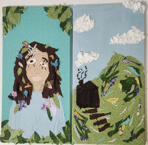
Title: Peace in Solitude
Size: 30.48 cm by 60.96 cm (x2) Medium: Fabric Collage on Canvas Date: March 2023 Exhibition Text
"Peace in Solitude" is a diptych collage created using only fabric and glue. This piece is meant to explore the theme of how our environments can have an impact on our identities, specifically how natural environments can bring peace of mind. This collage is focused on texture and how texture can be used to create movement. I drew inspiration from the works of textile artist Barbara Shaw, Pablo Picasso, and the landscapes of Ernst Ludwig Kirchner when creating this artwork.
|


INSPIRATIONS
|
Weeping Woman Portrait of Dora Maar
by Pablo Picasso by Pablo Picasso When looking at inspirations for the landscape part of my piece, I wanted to specifically research collage artists who work with a variety of materials to create their work. I came across the work of Barbara Shaw who creates a variety of different works often using fabrics and other materials to create beautiful collages. Barbara Shaw constructed detailed and colorful collages using delicately placed fabric scraps. Through the layering of fabric she is able to create a lot of texture in her pieces, she also creates shading in her pieces by using lighter pieces of fabric. When first researching her work, I was amazed by her piece Thame Flower Seller and the amount of detail in this piece. There are so many different aspects and small pieces of this collage, and it's made of a large variety of materials such as silk, cotton, lace, and other various fabric scraps. This same level of detail is shown in her piece Princes Risborough Church Street 2, with small details such as the bricks and windows of the buildings. When creating my own landscape collage, I want to be able to replicate this same intricacy.
|
When beginning to research inspiration for my piece, I was really drawn to the abstract work of Pablo Picasso. From the start I knew I wanted to create an abstract piece, and when researching abstract portraits I was very intrigued by the way that Picasso uses bright colors and shapes in his pieces. I really enjoyed the bold lines and distorted form of his piece Weeping Woman. There's a high contrast between the bold black lines and the brighter greens and yellows of her face. I knew I wanted to create a lot of contrast between colors in my piece as well, but with colors of more similar natural tones. I was also very drawn to Pablo Picasso's piece Portrait of Dora Maar. This painting didn't have as aggressive of contrast in the face, and rather has a night blend of soft colors. Both of these pieces came from the Cubist art movement which is typically recognized by its geometric shapes and merging of forms and figures. I wanted to follow the style of the Cubists when created the portrait part of my piece, and create a very geometric and abstract looking portrait.
In addition to Barbara Shaw and Pablo Picasso, I also drew inspiration for my piece from Ernst Ludwig Kirchner and some of his landscape pieces. Kirchner created landscapes of areas that were seemingly unaffected by the modern world and the destruction of the world around him. Many of his landscapes depict very serene natural spaces, with lots of vibrant colors and smooth brushstrokes. I was really drawn to the way that he used his paint to create movement in the scenes that he created. In his piece Bündner Landscape with Sunbeams a cabin is sitting peacefully isolated within the wooded mountains. I want to be able to create this same sense of peace while in nature with my own collage. |


PLANNING

After sketching out some more details of my piece, I decided to sketch them again but in color this time. I was sure to add in notes on where I needed to layer the fabric once I actually started the collage. I also brainstormed how I was going to begin the actual process of making the collage, and tried to decide what order I should put the layers down. I decided that it would make more sense for me to start the collage by making a base layer of the background color, and then begin layering other bases on top of it. I would continue using colors and patterns and layer it on top of each other to create texture like in Barbara Shaw's pieces Thame Flower Seller and Princes Risborough Church Street 2.

|
To start planning my collage I considered the theme that I wanted to portray through my piece. I knew that I wanted to combine both aspects of landscape and portrait into one piece, which led me to the decision to create a diptych. I planned that one canvas would display an abstract portrait while the other would be a landscape. I wanted the landscape to be a very wide open space, similar to many of Kirchner's landscapes. I also wanted to include a single cabin within the landscape to show the peace of isolation through nature. For the portrait part of my piece I obviously wanted to create an abstract portrait which included pieces of nature such as leaves, sticks, and flowers. I wanted to be able to show how our environments impact our identities, specifically how natural environments can have an impact on identity.
After I had a basic idea of what I wanted to portray through my collage, I began to plan out parts of my piece in more detail. I sketched out a possible style of how I wanted the portrait to look. I was sure to use the same Cubist style as Picasso, and abstracted the features of the portrait. I also included pieces of nature in my portrait such as flowers and leaves. 
I also dedicated a page of my sketchbook to the materials that I would be using for this project. I cut small pieces of the fabrics I would be using to get a visual representation of them, and to also figure out the exact uses for a few of them. I decided the patterned fabrics would be used for small detailed layering in the mountain, as well as flowers on the portrait. I chose a lighter blue fabric for the background of the landscape, and chose to use that same blue for my shirt in the portrait in order to create a visual connection between the two canvases. I also picked out a darker blue fabric with small white flowers as the background of my portrait. In addition, I also chose a color to be the base skin tone of the piece, and was able to find a slighter darker shade to use as a contour for some facial features. I sketched out some of the colored thread I would be using as well. I also included a rough sketch in the corner of this page to highlight where I would be using the thread. I wanted to use thread in this piece to not only add fine details, but to also use it as a method of attachment to my canvases.
|
PROCESS
|
After laying out all of the basic shapes of my piece, I began to further develop my portrait. I decided that the next step I should take is to create the hair. I started by laying out some flatter pieces of brown fabric in a way that made it look like the hair had some volume. I used fabric glue to attach these pieces to the fabric underneath. Once those pieces had dried into place, I cut up some more pieces and layered them on top of the base. I continued this process until I was satisfied with the amount of texture in the hair. Then I cut out some of the facial features of my portrait. I was sure to make these pieces in a similarly abstract way to Picasso and my planning sketches. I then glued all of those pieces onto the face and tried to lay it out in a way that structurally made sense. For the lips I followed a different process though. I cut apart some small pieces of different colored pink fabrics and glued them together to make the lip shape.
I continued to add different colored fabric onto the mountain, layering pieces on top of each other to create movement and texture. Once I had enough colorful pieces, I went back in with the lighter green to clean up some of the areas and once again add more texture. I also added clouds to my landscape piece by cutting up small pieces of white fabric and bunching them together in places that I had pressed down glue. I was heavily focused on texture with this piece, wanting to replicate Barbara Shaw's pieces and her techniques. I ended up having to scrap my idea of using thread to add fine details to the piece because the needles could not physically get through the canvas or fabric due to the glue being used to keep everything together.
To finish up my piece I went back over to the portrait canvas and added some leaves to the corners and edges of the piece to add a nice frame around everything and overall tie the piece together. |
I started my process by giving myself a solid base to start with. I wanted a smooth base so that I could slowly build up the texture off of the base. I brushed glue onto the canvas in an even layer, hoping that this would avoid any noticeable bumps through the canvas. Unfortunately the first time I tried this method, I pressed down too hard and the glue ended up soaking through the thin blue fabric I was using for the background of my landscape. However, I actually ended up really liking the different shades of blue that this created so I decided to just keep this mistake as part of the piece. For my next canvas I didn't press down as hard, and it dried nicely with no glue soaking through.
Once I had a base for my collage, I laid out pieces of fabric for some of the basic shapes in my piece. I cut out a piece of green fabric for the mountain of my landscape, keeping the edges looking a little rough so that it had texture like Barbara Shaw's pieces. I also cut out the basic face shape of my portrait, keeping it looking slightly abstract like Picasso's cubist portraits. In addition, I used the same fabric as the background for my landscape picture to make a shirt for my portrait. I used the same fabric because I wanted my two canvases to seem connected in some way. I decided to make this connection by using the same kinds of fabric in both of the canvases. 
Then, I moved back over to my landscape canvas. I placed some darker pieces of green fabric onto the mountain in a way in which that would give the illusion of movement. I also cut some strips of other colors and laid them out in random areas as well. I didn't want to add too many bright colors, because I still wanted the landscape to look natural. I used some of those same colors on the portrait canvas to once again form a connection between the two pieces. I also wanted to communicate my theme of how our environments can impact our identities, so I wanted to show that these two things are connected.
After I had a lot of the mountain done, I made the isolated cabin. This process was initially a little difficult because of the perspective of the cabin, but once I figured that out, I glued on the brown fabric. To add texture to this part of the piece, I used some black ribbon and brown yarn to not only give texture to the cabin but to also make it look more like a log cabin. 
|


EXPERIMENTATION
|
The other major type of experimentation I did was with the fabric in general. Since this was a new medium for me, I had to experiment with how to use the fabric in the first place. I was sure to buy fabric that was thin so that it was easy to manipulate with glue and cutting. I also bought a wide variety of colors and patterns of fabric so I could see which pieces would look the best together. Some colors that I was originally going to use actually ended up clashing together too much, and made the piece look too distracting so I ended up scrapping those ideas. I also tried to use colors that I thought would look good together and made the most sense for a piece that focused on natural hues. I used colors that would be seen in nature and paired them together with greens, browns, and blues to make a natural portrait and landscape. |
My primary means of experimentation with this piece involved layering and texture. Specifically with areas of the piece like the hills and hair, texture was extremely important. For the hair I wanted to make it look like it had volume and movement. I experimented with different ways to layer the strands of hair such as twisting the fabric, cutting it into smaller strands and laying pieces on top of each other. It was really interesting to discover the different effects I could make using fabric since this was a brand new medium for me. I also did a lot of experimenting when making the hill of my piece. I used a lot of different colors, shapes, and sizes of fabric to make this part of the piece. I had to see which size and shape of fabric would give the best movement in my piece. Some chunks of fabric ended up being too large so I needed to go back over them with other colors to even it out and create balance within the piece.
|


CRITIQUE

|
|


There are a lot of similarities between my pieces and my inspirations Barbara Shaw and Pablo Picasso. One similarity between my piece Peace in Solitude and Shaw's piece Thame Flower Seller is the medium used to make these pieces. Both Shaw and I used fabric to create movement and texture in our pieces. We both also used a variety of different colors and shapes of fabrics to create our pieces as well. In addition, both of our pieces display a scene with some sort of building included. A similarity between my piece and Picasso's piece Portrait of Dora Maar is obviously the abstraction of the features. Both of us used some sort of abstraction somewhere in the face, mine was with the eyes and the nose and Picasso's involved the same features. In addition, we both also created a portrait of a woman that includes many different colors.
There's also a lot of differences between my pieces and my inspirations. For starters, when creating my landscape I completely made up a location and the piece wasn't based on anything I had ever seen before. When Barbara Shaw created her landscapes, she often found inspiration from places she had seen before. In addition, Shaw also included people throughout her piece which I did not include in mine. I have also chosen to create a portrait using fabric which is something that Shaw has not experimented with in her medium. Another difference between my piece Peace in Solitude and Picasso's piece is the medium that was used. He used oil paint which allowed him for a smooth piece, whereas I used fabric.
There's also a lot of differences between my pieces and my inspirations. For starters, when creating my landscape I completely made up a location and the piece wasn't based on anything I had ever seen before. When Barbara Shaw created her landscapes, she often found inspiration from places she had seen before. In addition, Shaw also included people throughout her piece which I did not include in mine. I have also chosen to create a portrait using fabric which is something that Shaw has not experimented with in her medium. Another difference between my piece Peace in Solitude and Picasso's piece is the medium that was used. He used oil paint which allowed him for a smooth piece, whereas I used fabric.
REFLECTION
Overall, this project tested a lot of my skills as an artist. I was very challenged with this piece because it involved a medium that I had never worked with before. I've made some collage pieces before, but never of this size and never having used fabric. I've also never tried to actually communicate a theme and actual image while making these collages. This project really tested my patience because of all of the smaller details involved in making it. I had to individually cut so many smaller scraps and pieces, which was the most time consuming part of this piece. It was also difficult to manipulate the fabric in order to follow what I wanted my piece to look like, and make sure that the piece followed my theme. My favorite part of this process was experimenting with texture. Texture isn't something that I get to experiment with often because many of my pieces are usually just smooth paintings. It was interesting to try and manipulate this medium to create movement and texture. My least favorite part of this project was how tedious it was. It took a lot of time to make this piece, and a lot of time and effort was put into it. I hope that others are able to look at my piece Peace in Solitude and consider how their environments can have an impact on their identities.
ACT QUESTIONS
1. Clearly explain how you are able to identify the cause effect relationship between your inspiration and its effect on your artwork?
The inspirations of my piece can be seen in the way that I use texture to create movement and dimension within my piece.
2. What is the overall approach the author has regarding the topic of your inspiration?
The way that texture can be used in a piece to create different effects.
3. What kind of generalizations and conclusions have you discovered about people, ideas, culture, etc. while you researched your inspiration?
I have discovered that people who make collages often put a lot of effort into manipulating the materials.
4. What is the central idea or theme around your inspirational research?.
How texture can be created using a variety of materials and methods.
5. What kind of inferences did you make while reading your research?
I inferred that when people take the time to create texture in their pieces, they want to communicate some sort of message using that texture.
CITATIONS (MLA)
Tate. “Cubism.” Tate, https://www.tate.org.uk/art/art-terms/c/cubism.
Ingram, Heidi, and Admin. “Barbara Shaw: Painterly Fabric Collages.” TextileArtist.org, 25 Mar. 2019, https://www.textileartist.org/barbara-shaw-painterly-fabric-collages/.
“Paintings.” Ernst Ludwig Kirchner Paintings, https://www.thehistoryofart.org/ernst-ludwig-kirchner/paintings/.
“Pablo Picasso and His Paintings.” Pablo Picasso: 150 Famous Paintings, Bio & Quotes by Picasso, https://www.pablopicasso.org/.
