ILLUSTRATION
|
Overview
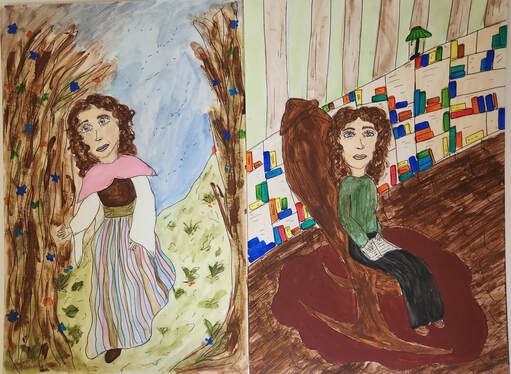
Title: Within the Pages
Size: 25 cm x 38 cm (per illustration board) Medium: Gouache and Ink on Illustration Board Date: April 2023 Exhibition Text
"Within the Pages" is a set of illustrations created using gouache and black ink. This piece is meant to explore the contrast between reality and fiction created while reading a story. I wanted to showcase how reading can make us feel like we've entered another world, and the lost feeling of being brought back to reality after closing the book. I drew inspiration from the children's book illustrators Beatrix Potter and Clement Hurd when creating this piece.
|

|

|
INSPIRATIONS
|
Continuing with the trend of children's books illustrators, I stumbled across the work of Clement Hurd who is arguably most well known for his illustrations in the book "Goodnight Moon". This book also happens to feature rabbits in a fantasy world which I thought was an interesting connection between my inspirations. I was really drawn to the bright, solid colors used by Hurd in his illustrations in comparison to the lighter colors of Potter's. Clement Hurd used paint while creating his illustrations, which gave his pieces a much more solid look. On the other hand, Potter used watercolors which allowed for more light blending in her pieces. I was specifically drawn to one scene in "Goodnight Moon" where a rabbit is displayed sitting in a rocking chair and knitting. I thought that there was something very calming about this scene, and decided that it was the one that I wanted to recreate in my own illustration. |
When searching for inspiration for this project, I was having difficulty finding illustrations that fit the aesthetic of what I wanted my piece to look like. I wanted inspiration that seemed whimsical and peaceful. I decided I had to narrow my search down from just "illustrations" in general to "children's illustrations" because I wanted to look at illustrations that had been made to go along with stories. One of the most popular children's book illustrators that I came across was Beatrix Potter. She is the illustrator for the Peter Rabbit book series which describes a fantasy world full of rabbits and adventures. I was really drawn to Potter's work because I really loved the airy and light quality of her work. Most of her illustrations have a similar style to them, all seeming nostalgic and whimsical. She used light watercolors, with outlined portions using ink. I was also really drawn to the way that she used her illustrations to tell a story. I wanted the theme around my work to be focused on how people can create a fantasy world through reading, and how stories can become an integral part of our identities, so I thought it was important to take illustrations from stories.
|


PLANNING

Next, I drew my attention to my other inspiration, Clement Hurd. On these sketches, I actually began to experiment with the gouache that I had planned on using for my illustration. I chose one scene in particular from a book that Clement Hurd illustrated, "Goodnight Moon", and sketched it into my book. For one of these sketches I used straight gouache, and for the other I used watered down gouache. I wanted to see the difference between these methods. I also wanted to get a basic idea of the shapes and forms I would be replicating in my own illustration. In addition, I made a rough sketch of how I would modernize Clement Hurd's illustration.

|
To start planning my illustrations, I considered the theme I wanted to display through my artwork. I knew that I wanted to show a contrast through both of my illustrations, and I wanted to incorporate something about reading into the piece. After looking at some children's book illustrators for inspiration, I came up with my idea of showing the contrast between our reality and the imaginary scenarios we see in our heads while reading. I started off by looking at illustrator, Beatrix Potter, and determined that it would be helpful for me to draw out some of her illustrations so that I could get a sense of her style and aesthetic. I really wanted to focus on how she used very light colors, with darker outlines. I also drew attention to how she used very natural colors in her pieces. After sketching out two of her pieces, I adapted one of her rabbit sketches into a person. I did this in order to get a basic idea of how I would want my own illustration to look. At this point I also determined that I would want to use a more watered down gouache for this illustration in order to achieve the light, airy look that Potter's pieces had.

To finish off my planning, I made two basic illustrations of what I wanted my own pieces to look like. By doing this I was able to lay out some of the basic forms, colors, and layouts of my illustrations. I was able to figure out that for one of my pieces I wanted to use much more watered down and light colors, while for the other I wanted to use darker, solid colors. In addition, I was able to see things that I needed to improve when actually creating my illustrations. For example, I realized it may be beneficial for me to take reference pictures for the poses I'm using, as well as work on my proportioning.
|
PROCESS
|
I did this same base for the hair because while experimenting I discovered that it would look best if I layered the different strands of hair rather than just having one flat chunk of hair. I also began working on the skirt at this point, using the same colors as my planning sketches and creating stripes. It was important for me to use these lighter colors because not only were they similar to Beatrix Potter, but they also helped to created a light, whimsical aesthetic in the piece.
After getting all of the colors down onto the board, I went back in with a black pen to outline features throughout the illustration. I think that doing this really brought the piece together, and also followed a similar technique that Beatrix Potter used in her illustrations.
Next I moved on to my other illustration. This one was a lot more difficult and time consuming for me to complete because of all of the layering it required since my gouache was so thin. I began this illustration by painting the wooden floors. Luckily for me, the thinner gouache actually worked in my favor for this part because the streaks of the paint gave the illusion of wood flooring. I used the same method for the hair on this illustration, and it gave me the same effect as it did in the other illustration. I also painted in the chair, and the rug. The rug was very difficult for me to paint with gouache because it took so many layers to create a clean solid look like Clement Hurd's illustrations. Once everything in the foreground of this piece was complete, I moved onto the background and painted in the book shelf and the wallpaper. Once again, once all of the colors were complete I went in with black pen and outlined everything.
|
To begin my illustration, I first had to transfer my sketches from my sketchbook onto my illustration boards. I had to make sure everything had proper proportions and layouts. Once everything had been sketched out, I began on my first illustration board. I decided to start painting some of the clothing. Like Beatrix Potter did, I used lighter watered down paint for the clothing. One thing that I discovered about gouache though while experimenting with it was that it would need multiple layers, especially if it was watered down. While I was waiting for those parts to dry, I began to get a base down of brown paint for the treeline. This base was very helpful because it allowed me to start layering other paints on top of the brown to give texture and dimension to the piece.
I continued to add color throughout my illustration, using watered down gouache to create light bases and then adding color over that base. One issue that I ran into in this proccess though is that it's very easy to wipe gouache away with water. Since gouache is a new medium to me, I was unaware of this and struggled with it throughout this illustration in particular. A solution I found to this was to use less force when adding the layers, in order to lessen the chance of wiping away from work underneath.
|


EXPERIMENTATION

After I had a basic understanding of how to use gouache, I wanted to experiment with how I would use it in my specific illustrations. I first experimented with how to create movement in the skirt using different layering and tones of color. I also tried different methods to create layering in the hair. For some I let other parts dry before layering on top, and for others I did everything at once but used different tones. In addition, I experimented with skin tone in general, and how to create shading using the gouache.

|
A lot of the experimentation that I did for this project involved learning how to use gouache. I had never used gouache before this project, so I had no clue how to use it. I had a basic notion that it worked in the same way as a medium like acrylic paint, but decided that before I made my piece, I needed to understand more about it. I tried a lot of different methods to understand the most efficient ways for me to use the gouache. I tried using it with a dry brush, and a wet brush. I also watered down some to see if I could attain the same effect that a watercolor paint would have. In addition, I experimented with layering the gouache. I used a light tone of a color and slowly created an ombre of color through layering. I also experimented with line thickness, outlining, and how much paint I should put onto my brush.

A lot of the experimenting I did in the piece itself involved the layering of gouache. I had to try different methods to make sure that I wasn't wiping away any of the lower layers of paint, but still make sure that I was able to layer the paint. I had to experiment with different painting techniques such as using less pressure, and the amount of paint or water that I was putting onto my brush.
|
CRITIQUE
|
|
|
There are a lot of similarities between my piece and Clement Hurd and Beatrix Potter's illustrations. One similarity between my first illustration and Beatrix Potter's illustration is the similar color pallets used in both pieces. We both used natural colors to create a whimsical and natural aesthetic. Another obvious similarity between my illustrations and my inspirations is that the same poses and environments were used in these pieces. My first illustration follows one character in the woods in a similar way that Potter does in this chosen scene from "Peter Rabbit". My second illustration also features similar aspects as Clement Hurd's illustration from the children's book "Goodnight Moon." Even further, both my piece and my inspirations involve a theme of reading and imagination.
There's also a lot of differences between my piece and my inspirations. For starters, my inspirations clearly have a rabbit as the main figure in their drawings whereas mine is a woman instead. In addition the color palettes for my second illustration and Clement Hurd's illustration are drastically different. Hurd uses a lot more bright and vibrant color for his piece, while I went for a different approach and used more natural colors. In addition I made two illustrations that coordinate with each other to make a theme, whereas as Beatrix Potter and Clement Hurd both create illustrations to convey a theme throughout an entire children's story.
There's also a lot of differences between my piece and my inspirations. For starters, my inspirations clearly have a rabbit as the main figure in their drawings whereas mine is a woman instead. In addition the color palettes for my second illustration and Clement Hurd's illustration are drastically different. Hurd uses a lot more bright and vibrant color for his piece, while I went for a different approach and used more natural colors. In addition I made two illustrations that coordinate with each other to make a theme, whereas as Beatrix Potter and Clement Hurd both create illustrations to convey a theme throughout an entire children's story.
REFLECTION
Overall, this piece really challenged me as an artist in a variety of ways. Gouache is a medium that I had never worked with before, which came with its own set of challenges. I had to learn what works and doesn't work with this medium, and had to change many of the methods that I would use with other painting mediums such as acrylic paint. In addition, I had never worked with an illustration of this size before. I'm used to drawing on smaller sheets of paper rather than a large illustration board. Through this piece though, I was able to improve my ability to work with gouache and overcome challenges that I faced while exploring this new medium. My least favorite part of this process was actually working with the gouache. Though it was interesting to experiment with, I'm not sure that I'd use gouache again the way that I used it in this piece. I think in the future I would opt to only use watered down gouache to create artwork because I don't like the streaky look of the straight gouache. My favorite part of this piece was the concept behind it. I think it was enjoyable to find a way to show contrasts in my own life, and I enjoy reading so I liked being able to incorporate that into my piece. I hope that people are able to look at my piece Within the Pages and consider how reading, or other forms of media, influence and shape their identities.
ACT QUESTIONS
1. Clearly explain how you are able to identify the cause effect relationship between your inspiration and its effect on your artwork?
There is a very clear relationship between my piece and my inspiration. I used the same elements in Beatrix Potter and Clement Hurd's illustration in my own pieces.
2. What is the overall approach the author has regarding the topic of your inspiration?
The overall approach was how children book illustrators use color and their chosen mediums to create certain aesthetics.
3. What kind of generalizations and conclusions have you discovered about people, ideas, culture, etc. while you researched your inspiration?
I have discovered that people associate certain shades of colors with certain ideas. Such as lighter colors being associated with peace and lightness.
4. What is the central idea or theme around your inspirational research?.
The central theme around my research was how children book illustrators create aesthetics in their illustrations.
5. What kind of inferences did you make while reading your research?
I inferred that the inspirations I found were targeting their work towards children.
CITATIONS (MLA)
House, Penguin Random. “About.” Peter Rabbit, 27 Aug. 2021, https://peterrabbit.com/about/.
“Goodnight Moon by Margaret Wise Brown, Clement Hurd (Illustrator).” The Children's Hour Bookstore, https://childrenshourbookstore.com/products/goodnight-moon-board-book-by-margaret-wise-brown-clement-hurd-illustrator?pr_prod_strat=description&pr_rec_id=ff87936eb&pr_rec_pid=4754301419613&pr_ref_pid=4753409605725&pr_seq=uniform.
Tim Warnes. “Finding Solace in a Bowl of Mush.” Tim Warnes, Tim Warnes, 3 Nov. 2022, https://www.timwarnes.com/blog/2019/8/2/finding-solace-in-a-bowl-of-mush.
