ACRYLIC DIPTYCH
|
Overview
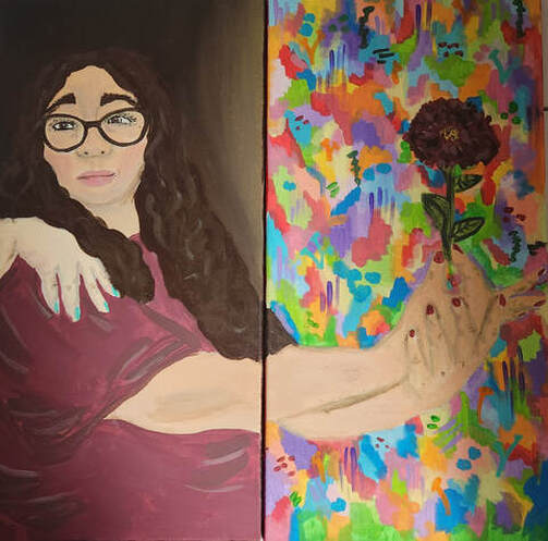
Title: Solace
Size: 60.96 cm x 30.38 cm (x2) Medium: Acrylic Painting on Stretched Canvas Date: July 2023 Exhibition Text
"Solace" is an acrylic painting meant to represent the feeling of meeting someone who provides you comfort and joy, and that person having a large impact on your identity. This piece is meant to explore how people can provide a positive light in your life, and encourage you to explore and embrace your identity. This painting is focused on color and shading, as well as heavy contrasts. I drew inspiration from the Baroque art movement as well as the work of Post-Impressionist, Pierre Bonnard.
|
INSPIRATIONS
|
The next art movement I found inspiration from was Post-impressionism, specifically the artwork of Pierre Bonnard. This artwork was the complete opposite of the Baroque art movement, which is exactly why I chose it as my inspiration for the other side of my canvas. Pierre used lots of bright and vibrant colors in his work which instantly drew me to his pieces. I was particularly drawn to his piece "Garden" due to the bright and almost childlike look to the painting. This piece consists of a lot of different colors and shades working together in harmony to create an appealing piece. I also like how the piece wasn't very detailed, and all of the forms throughout the piece seemed to be simplified. I wanted to use the same technique on the lighter side of my diptych. In addition, I was also inspired by his piece "Summer" for similar reasons. I really enjoyed how vibrant the colors were throughout this piece, and how despite using such a wide variety of colors Bonnard was still able to create very clear forms. |
When originally searching for inspiration for my painting, I knew that I needed to find two art movements or artists whose art would show a heavy contrast between each other. Contrast was a major thing I wanted to portray through my piece, so it was important that I found artwork that also showed contrast. The first art movement I looked to for the darker side of my diptych was Baroque. The Baroque art movement was heavily focused on lighting and dramatics. Many of the pieces in this period featured dark background with the people featured in the paintings being lit up with dramatic lighting. One painting that show this very well is "David with the Head of Goliath, 1610" by Caravaggio. I was really drawn to this painting because of the extremely dramatic lighting in this piece. Everything also seemed to flow very well in this piece, and I also enjoyed how contrasted the background and foreground of this piece was. I was also inspired by "The Astronomer" by Johannes Vermeer and the way that he chose to use a warmer shade of lighting in this piece. Rather than having harsh white light, he chose to have more of a warm yellow light coming in through the window.
|


PLANNING
|
When planning out my piece, I also tried to experiment with different poses. I wasn't sure which direction I wanted to be facing, or even if I wanted one arm or both to be held out. After drawing out some different poses, I decided on actually having both of my arms held out because I simply thought that it looked better than if I just used one arm. I also experimented with the angle that I held my head at, and tried to decided which way I wanted to be facing.
On this page I also focused on how to make a gradient using paint which is a skill that I have found difficult in the past. I practiced a few different methods of creating these gradients that I hoped to use on the darker side of my diptych. On my final sketch page I made another sketch of the key elements of my piece, and color blocked what I wanted to include. I didn't include any detailed shading or anything on this sketch because I just wanted to outline the basic colors I wanted to use throughout the piece. After painting the scenes, I realized that there were a lot of changes I wanted to make to the piece. For starters, I wanted to add more shapes and variety in the background of the lighter canvas. In addition, I also realized that the stark black may be too intense of contrast, and I decided that it might be better if I used a very dark brown instead. I also noted that I wanted more darkness further down on the canvas rather than the light surrounding my head. Overall, this basic sketch of the pieces made me realize what needed to change and keep in mind when creating my actual painting. |
When beginning to plan my piece I needed to physically write down my overall theme for this piece so that I could keep it in mind throughout the piece. I decided my theme for this piece would show how meeting the right person, or finding the right support system, can bring you out of the darkness and allow you to thrive again. I wanted to show this through contrasting colors on each diptych, one being light and the other being dark.
I also created a basic sketch of what elements I wanted to include in both of my paintings. In one painting I wanted it to just be my hand holding a flower to show growth and life. In the background of this piece would be splashes of light colors and shapes which blended together to create an array of shades. On the other canvas would be the other half of me, minus the arms. This canvas would be much darker and use darker shades of blues, browns, grey, and black. I also wanted another arm holding my shoulder to represent the support that I was receiving in order to reach out of the darkness. 
|


PROCESS
|
After I was happy with how the backgrounds look, I started to color block in some of the main parts of the piece such as the face, arms, and hands. I did a base coat of the color I was using for my skin, so that I could go back over this with another layer and also begin shading as well. In this painting I really wanted to work on my shading skills, so I spent a lot of time on the face and hands in order to make sure the shading looked right.
After I finished the skin, I used that same color to mix a shade for the lips in order to make it look more natural. In addition, I started to use brown to color in my eyebrows and hair. With my hair, I was struggling to create enough of a contrast between my hair and the background of the piece. I eventually solved this by adding lighter highlights into the hair. After finishing the hair, I went back to the face to add more expression to it and finish the eyes. With the eyes I really wanted to challenge myself to show a smiling expression through the ways the eyes folded and were shaped. Since my eyes gets smaller when I smile, I had to find a way to make my eyes seem more shut than they usually would be, but still open enough to see them. |
To begin my process, I first created a reference picture for myself and projected it onto the canvases I made. I sketched out the key features of the piece in order to get the correct placement and proportion of the different elements.
Once it was traced, I started out with the background of my piece. I started out with my canvas inspired by Post-Impressionist Bonnard and used a wide variety of colors and filled up the white space of this canvas. I didn't try to be too precise with where the colors were placed because I wanted it too seem more "creative" and care-free. While waiting for the background of that one to dry, I moved on to the Baroque inspired canvas. On this canvas I used a dark brown to create a gradient on the background, slowly using a lighter brown as I neared the right edge of the canvas. I also painted the hand on my shoulder, using the same technique as earlier, but this time I made the skin color slightly paler than mine in order to show that it was someone else's hand on my shoulder.
Then I finished up by painting the shirt and flower. I added some shading to the shirt in places where the shirt would be creased. When painting the flower, I used the same color as the shirt in order to not only make a connection between the two canvases, but also to represent how this blooming flower is supposed to represent me "blooming" and embracing growth in my life. |


EXPERIMENTATION
|
In addition, I also did a lot of experimentation with laying out a variety of colors, as well as experimenting with mixing a wide collection of colors in general. For my canvas inspired by Bonnard, I wanted to use bright and vibrant colors. I mixed a lot of different colors together in order to get unique shades to use in the background of the piece. I was able to create a never-ending collection of different shades of colors.
When it came to actually putting these colors onto the canvas, I had to experiment with where to place the colors next to each other. I wanted there to be a lot of separation between the colors, so I didn't want to put too many of the same shades right next to each other. I discovered that if I put too much of the same color near each other, it just made it seem like a large space of one color rather than a lot of separate colors coming together to make up the background. |
One of the main ways that I experimented throughout this piece was through shading, specifically when working with the background of the Baroque inspired piece and the skin throughout the entire painting. With the background of the darker side of the diptych, I wanted to create a gradient effect to show how it's getting lighting as you get closer to the bright, colorful canvas. Rather than using a black to white gradient, I did a brown to almost yellow gradient. I chose to use brown rather than black because brown made the background seem warmer than if I had just used a cold harsh tone like black and white.
I also experimented with a lot of shading throughout the skin and face of this piece as well. Prior to this piece, I had never done a lot of pieces that required heavy shading like the Baroque art movement because I had been focused on other art movements. I had to experiment with a lot of different shades to make sure I was using the right shades for highlights and shadows. |


CRITIQUE

|
|

There are a lot of similarities between my work and my inspirations. One similarity between my piece and "David with the Head of Goliath, 1610" by Caravaggio is our use of lighting and shading. Both of our piece have a dark background with the main figure of the piece being bright and lite up in comparison to the background. In addition, we both used techniques common to the Baroque art period for painting people such as highly detailed features and shading of skin. In addition there are similarities between my piece and Pierre Bonnard's piece "Garden". For starters, we both use a wide array of colors throughout our pieces, and most of the colors and light and vibrant. We both also don't create a lot of definition in our pieces, and they both have a sense of freedom and child-like joy to them.
There are a lot of differences between my piece and my inspirations as well. First of all, I combined both of my inspirations into one piece that worked together in harmony. I combine these two completely different art movements and artists into one piece. In addition, I chose to create a self portrait whereas neither of y inspirations were self portraits, and Bonnard's piece was actually a landscape with no people in it at all. Thematically our pieces are different as well because I chose to make a piece about support within friendships, which was not the theme of either of my inspirations.
There are a lot of differences between my piece and my inspirations as well. First of all, I combined both of my inspirations into one piece that worked together in harmony. I combine these two completely different art movements and artists into one piece. In addition, I chose to create a self portrait whereas neither of y inspirations were self portraits, and Bonnard's piece was actually a landscape with no people in it at all. Thematically our pieces are different as well because I chose to make a piece about support within friendships, which was not the theme of either of my inspirations.
REFLECTION
Overall, I am very happy with the outcome of this piece and the skills I was able to experiment with throughout the creation of this piece. I really enjoyed working with realistic shading throughout this piece, since every portrait I had made up to this point had been more abstract and didn't require actual shading. I also enjoyed getting to practice painting hands since this is not something I often include in my pieces because I don't view it as a strong suite of mine. However, I think I was able to improve my ability to create realistic hands through this piece. This was the first time I had ever made an acrylic painting diptych, so it was also interesting to see how I could make these two separate canvases connect in order to make one cohesive piece. My favorite part of this piece was the theme behind it. The friendships and relationships I've made throughout the last few years are very important to me, and they truly changed my life, so it felt great to finally make a piece to represent how my identity has been positively changed by the people in my life. I hope people can look at my piece "Solace" and consider which people in their life have had a positive effect on their identity.
ACT QUESTIONS
1. Clearly explain how you are able to identify the cause effect relationship between your inspiration and its effect on your artwork?
You are able to visibly see the connection between my work and my inspirations. I use the same lighting and shading techniques are Caravaggio, and the bright and vivid colors of Bonnard throughout my paintings.
2. What is the overall approach the author has regarding the topic of your inspiration?
The way that shading can be used to create the illusion of lighting through a painting.
3. What kind of generalizations and conclusions have you discovered about people, ideas, culture, etc. while you researched your inspiration?
I have discovered that different colors can be used to create different forms of lighting throughout a piece. Some colors will create harsher lighting, while warmer colors will create warm lighting.
4. What is the central idea or theme around your inspirational research?.
How to create realistic shading and lighting throughout a piece.
5. What kind of inferences did you make while reading your research?
I inferred that using two completely different art movements would create a completely contrasting piece.
CITATIONS (MLA)
“Baroque Art and Architecture Movement Overview.” The Art Story, www.theartstory.org/movement/baroque-art-and-architecture/. Accessed 14 July 2023.
“The Astronomer.” The Astronomer by Vermeer, www.thehistoryofart.org/vermeer/astronomer/. Accessed 14 July 2023.
Tate. “Pierre Bonnard 1867–1947.” Tate, 1 Jan. 1970, www.tate.org.uk/art/artists/pierre-bonnard-781.
“Pierre Bonnard Lete Summer.” Arthipo, www.arthipo.com/pierre-bonnard-lete-summer.html. Accessed 14 July 2023.
